How to Design an App Icon in 2026: Sizes, Styles and Mistakes to Avoid
Exact iOS and Android icon specs, a step-by-step grid method, dark mode variants, and the seven mistakes that sink most app icons.

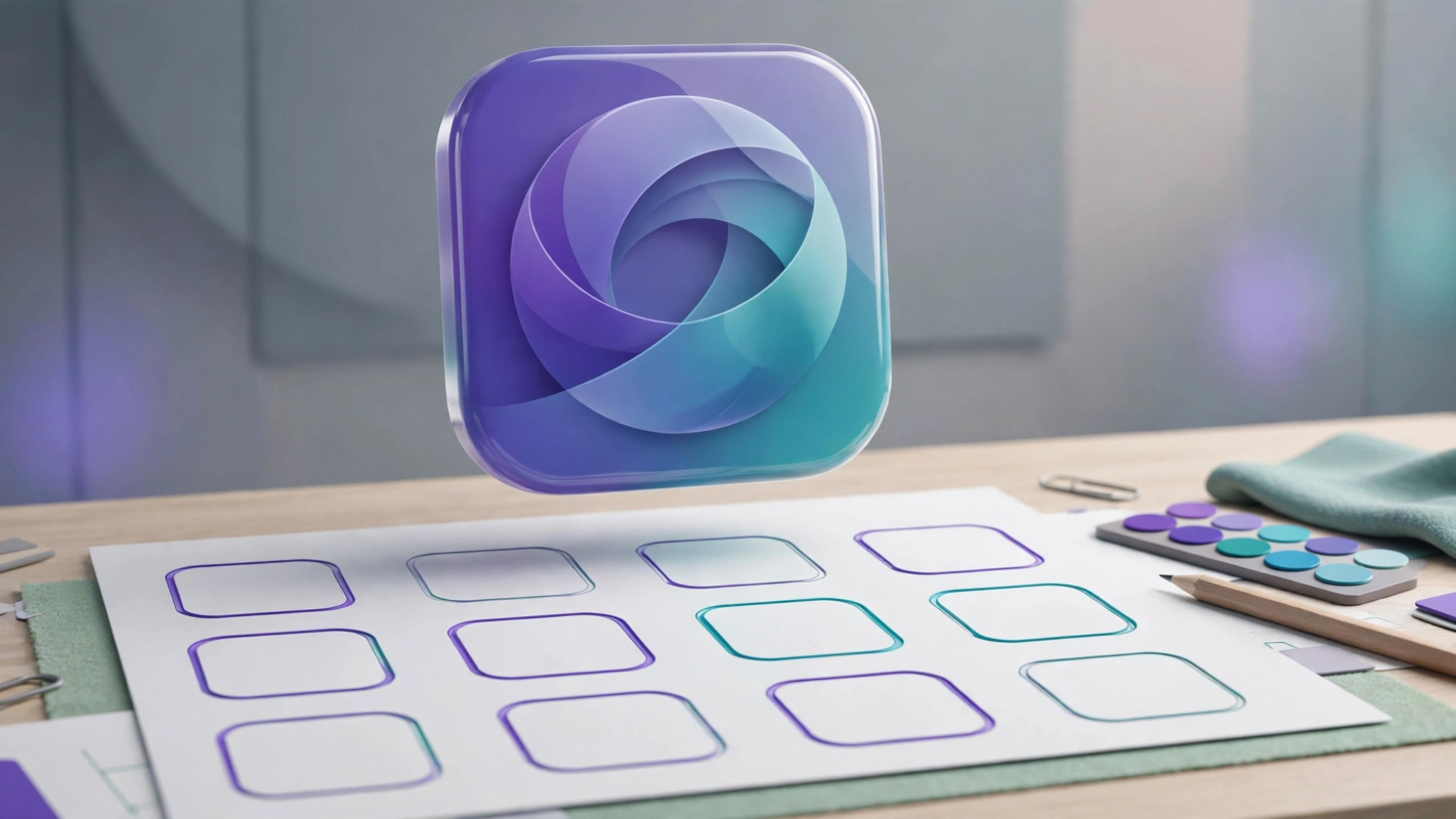
An app icon is the smallest advertisement your product will ever run. It is judged in a fraction of a second, at the size of a fingernail, surrounded by competitors. Getting it right is mostly a technical discipline: platform specs, safe areas, size testing, and variants. The artistry matters, but only after the engineering. Here is the full method, from canvas setup to App Store submission.
Key takeaway: To design an app icon in 2026, start with a simple silhouette that survives at 48 pixels, build it on the platform grid (Apple’s superellipse mask for iOS, adaptive layers for Android), keep key content inside the safe area, and prepare light, dark, and tinted variants. Export a 1024 by 1024 PNG for iOS plus adaptive assets for Android, and test at tiny sizes before shipping.
Nail the platform specs first
iOS and Android mask, scale, and recolour icons differently, so one flat PNG cannot serve both platforms properly. Learn the two spec sheets before you draw anything.
iOS: one master asset, system-applied mask
Apple asks for a single 1024 by 1024 pixel marketing icon with no transparency and no rounded corners; the system applies its own continuous-corner superellipse mask at every size. That means your corners must be square in the source file, and any background must fill the full square. Apple’s Human Interface Guidelines for app icons document the full size ladder, from 1024 down through the sizes used on iPhone, iPad, and watchOS, so design detail that only shows at full size will simply vanish in use.
Since iOS 18, users can also apply a tinted mode that recolours icons across the home screen. Icons that depend on a specific background colour or photographic detail break down in this mode, which is why a strong standalone glyph matters more than ever.
Android: adaptive layers and keyline shapes
Android uses adaptive icons: a foreground layer and a background layer, each 108 by 108 dp, that the system masks into shapes chosen by the device or launcher. Google’s Material Design icon guidance defines the safe zone as the central 66 dp circle where content is never clipped by any mask, plus keyline shapes (circle, square, rounded square, and rectangles) that keep icon families visually consistent.
Since Android 13, themed icons let users apply a monochrome treatment across the launcher. If your icon cannot survive as a single-colour glyph, it will look broken next to every icon that can. Design the monochrome version deliberately instead of discovering it after launch.
The grid and safe area method, step by step
Follow these steps in order. Each one builds on the last, and skipping ahead is how icons end up cluttered or clipped.
- Set up a 1024 by 1024 canvas. Design large so you can export down cleanly; never design at 180 pixels and scale up.
- Draw the silhouette first. Block out one recognisable shape with no detail, no gradients, no text. If it does not read at this stage, detail will not save it.
- Snap to the keyline grid. Align your mark to the platform keyline shapes so it feels at home next to system icons. Keep stroke weights and corner radii consistent.
- Respect the safe area. Keep all critical content inside roughly the central 80 percent of the canvas, with a 10 to 15 percent quiet margin at the edges. Masks will eat the corners.
- Limit the palette. Two or three colours is the sweet spot for recognition; our guide on how to choose brand colors covers how to pick a combination that survives small sizes.
- Test small before you finish. Shrink the icon to 64, 48, and 32 pixels and view it among real competitors on a phone screen. Fix what breaks, then continue.
- Build the variants. Produce dark mode, tinted, and Android themed versions now, while the design is still flexible.
- Export per platform. iOS gets the 1024 PNG; Android gets foreground and background layers as vectors with PNG fallbacks.
Styles that age well versus fads
Icon trends cycle every few years, but the icons that last share traits: one idea, confident geometry, and restraint. Use this comparison when a trend tempts you.
| Approach | Ages well | Trendy but risky |
|---|---|---|
| Form | Simple geometric mark, one idea | Thin-line illustrations crammed with detail |
| Colour | Flat duotone or a single confident hue | Rainbow mesh gradients that date fast |
| Depth | Subtle depth used sparingly | Heavy 3D and glossy effects as the whole concept |
| Metaphor | A literal, ownable object (a chat bubble, a leaf) | Abstract swooshes that could belong to anyone |
Gradients deserve a special note: they are not forbidden, and many strong 2026 icons use them, but they should support the silhouette, never replace it. The same applies to color theory for beginners: contrast and harmony rules that work in brand design apply directly to icon backgrounds.
Test at tiny sizes, not just on your artboard
Nobody will ever admire your icon at 1024 pixels. It will be seen at 48 pixels on a home screen, at 32 pixels in search results, and sometimes as a favicon-adjacent blur in a notification. Design backwards from that reality.
Run three checks. First, the shrink test: view the icon at 48 and 32 pixels and confirm the idea still reads. Second, the squint test: blur your vision and check that the silhouette is distinct from the ten icons around it. Third, the neighbour test: screenshot a real home screen, drop your icon in, and ask whether it belongs and stands out at once. Details that fail these tests are decoration, not design.
Dark mode, tinted, and themed variants
One icon is no longer enough. Plan for three contexts from the start rather than bolting them on at submission.
- iOS dark mode: provide an alternate asset with a darker background or an adjusted glyph so the icon stays legible on dark wallpapers.
- iOS tinted mode: since iOS 18, the system can recolour icons; keep a version whose glyph works when the background is stripped to a tint.
- Android themed icons: since Android 13, launchers can render your icon monochrome; supply a single-colour glyph that is still recognisable.
The practical upshot: your icon’s identity must live in the shape of the glyph, not in its background colour. If removing the background destroys recognition, the design is not finished.
Export formats and handoff
For iOS, export a 1024 by 1024 PNG in sRGB with no alpha channel, named clearly (AppIcon-1024.png), and hand it to the developer with the Xcode asset catalog slot it fills. Provide the dark and tinted alternates as separate named files so nothing is ambiguous.
For Android, supply the adaptive icon as vector drawables (SVG source) for the foreground and background layers, plus PNG fallbacks at the standard densities if the project requires them. Keep the source files organised: one Figma file or Illustrator document with the master artwork, the safe-area guides visible, and each variant on its own named artboard. A tidy handoff is part of the design.
Seven common app icon mistakes, and how to fix each one
- Cramming in detail. Thin lines and tiny elements vanish below 64 pixels. Fix: delete everything that is not the core idea, then test again at 48.
- Putting text in the icon. Words are unreadable at home-screen sizes and duplicate the app name shown underneath. Fix: replace text with a symbol that represents the same idea. This is one of the classic logo design mistakes that crosses over into icon work.
- Ignoring the safe area. Content near the edges gets clipped by masks and looks broken on some launchers. Fix: pull everything inside the central safe zone with a real margin.
- Depending on one background colour. Tinted and themed modes strip your background away. Fix: make the glyph recognisable on any background, including none.
- Copying a competitor’s metaphor. Another chat bubble or another paper plane makes you invisible in search. Fix: audit the top ten icons in your category and deliberately differentiate.
- Shipping without dark and themed variants. The icon looks fine on your phone and broken on the reviewer’s. Fix: design the variants in step 7 of the method above, not after rejection.
- Letting the icon drift from the brand. An icon that shares nothing with the logo or palette confuses returning users. Fix: derive the icon from the same mark, colours, and geometry as the brand.
Frequently Asked Questions
What size should an app icon be?
Design at 1024 by 1024 pixels as your master, which is what Apple requires for the App Store listing. For Android, work in the 108 by 108 dp adaptive icon format with separate foreground and background layers. Always export down from the master; never scale a small icon up.
Can I use the same icon for iOS and Android?
The artwork can share one concept, but the assets cannot be identical. iOS needs a single square 1024 PNG with no transparency, while Android needs layered adaptive assets that survive launcher masking and themed mode. Design one idea, then build two correct deliverables from it.
Should app icons have text in them?
Almost never. Text becomes illegible at home-screen sizes, and the app name already appears beneath the icon on both platforms. A symbol, initial letterform, or simple glyph communicates faster and survives shrinking. If the brand is text-based, reduce it to one strong initial.
What file format should I export an app icon in?
PNG for the iOS 1024 master and any raster fallbacks, in sRGB with no alpha channel for iOS. For Android adaptive icons, vector drawables from SVG sources are preferred so layers scale cleanly. Keep the editable Figma or Illustrator source as the single source of truth.
How do I make my app icon stand out in the App Store?
Stand out by being simple where competitors are busy. Audit the top charts in your category, note the dominant colours and metaphors, then choose a contrasting hue and a distinct silhouette. Test your icon in a grid of real competitors at small size; if you can spot it in one second, it works.
Conclusion
Strong app icons are built, not decorated. Master the platform specs, design one bold silhouette on the grid, keep it inside the safe area, and prove it at 48 pixels among real competitors before you fall in love with the details. The single takeaway: your icon’s identity must live in its shape, because colours, backgrounds, and fine detail are all stripped away by masks, tinted modes, and small sizes. Get the silhouette right and the rest follows. Keep one master file with the artwork, visible safe-area guides, and each variant on its own named artboard, so handoff is part of the design rather than an afterthought.