How to Make a Brand Mood Board That Clients Actually Approve
A practical 5-step process for building brand mood boards that clients approve, plus the best tools and the mistakes that get boards rejected.

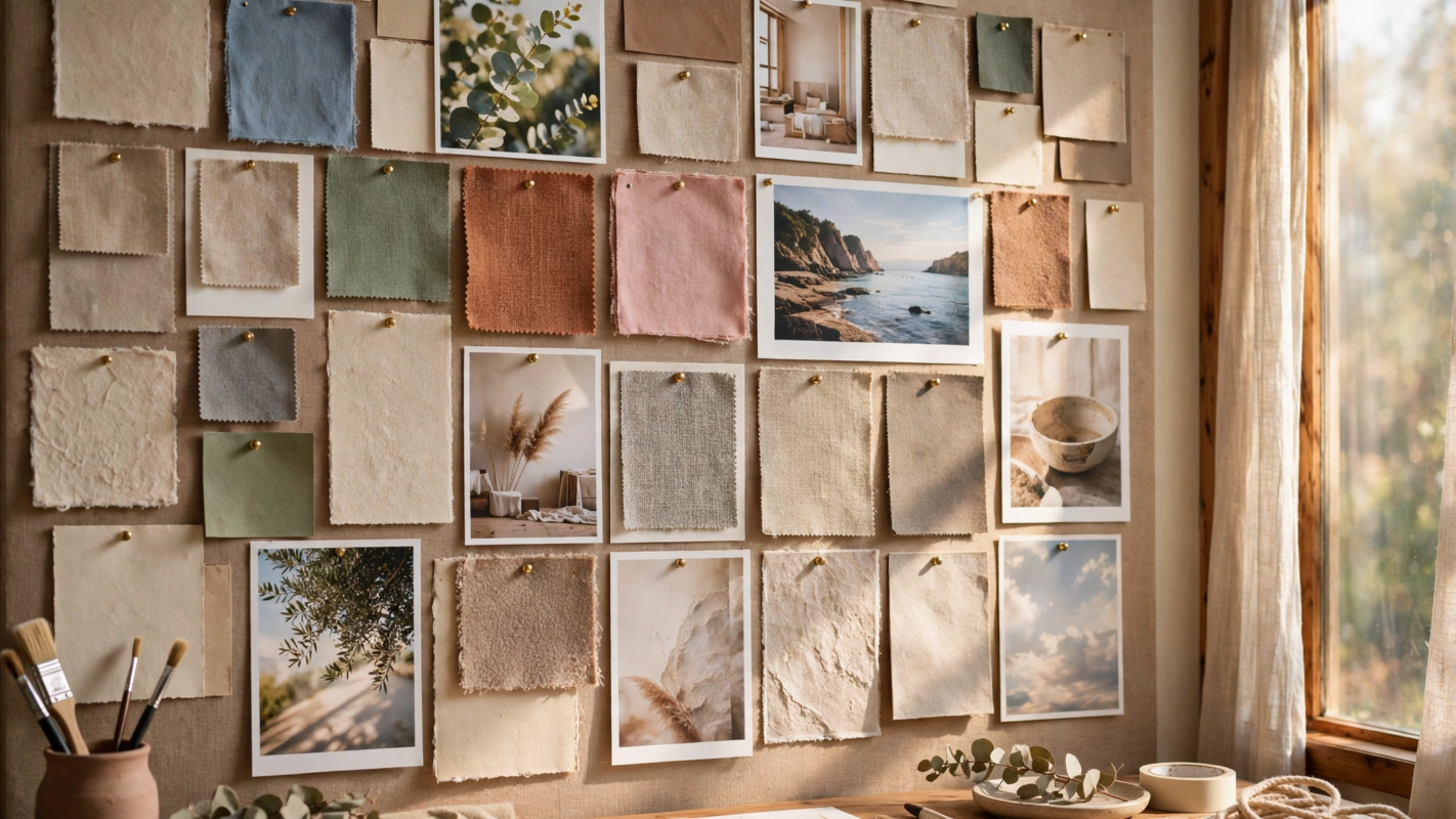
A mood board is the fastest way to get a client to say yes to a visual direction. Instead of debating adjectives like “bold” or “premium,” you show twenty images that define the feeling and ask one question: is this your brand? Done well, it kills bad directions early and makes every later decision easier. Done badly, it is a pile of pretty pictures the client ignores. Here is the process that gets approvals.
The short answer: To make a brand mood board that clients approve, start with three to five brand adjectives, then collect 20 to 40 curated images covering color, typography, photography, texture and layout in Figma, Milanote or PureRef. Arrange them in a clear grid, add a short written rationale, and present two directions maximum. Boards get rejected when they are unfocused, overloaded or disconnected from the client’s brief.
Step 1: Define the direction in words first
Before collecting a single image, agree on three to five adjectives with the client. Warm or cold. Playful or serious. Heritage or futuristic. This short list is your filter: every image must earn its place against these words. Boards fail most often because the designer skipped this step and collected images that point in five directions at once.
Write the adjectives at the top of the board itself. When you present, they become the frame for every choice you made. This connects directly to the strategy work in design thinking: you are defining the problem before designing the solution.
Step 2: Gather inspiration widely, then curate ruthlessly
Collect far more than you need, from more sources than you expect. Aim for 80 to 100 raw images, then cut to 20 to 40 final tiles. The cut is the craft. A board with 60 images says nothing; a board with 28 deliberate ones says everything.
Where to source images
Pinterest remains the fastest visual search engine on the planet, and its scale is enormous: Pinterest reported 537 million monthly active users in the fourth quarter of 2024. Use secret boards to collect without polluting your public profile. Unsplash and Pexels supply free photography with clear licenses. For typography references, browse Google Fonts and foundry sites directly rather than screenshots of unknown origin.
Steal from outside the client’s industry. A fintech brand can learn more from a boutique hotel’s photography than from ten competitor banks. Cross-industry references are what make a board feel fresh instead of derivative.
What to include
Cover five categories: color palettes or swatches, typography samples, photography style, texture and material, and layout or composition references. A board that is all photography gives the client no read on type; a board that is all color gives no read on tone. Balance the mix so the client can imagine the whole brand.
This is also the moment to start thinking about palette. Our guide to choosing brand colors pairs well with the color section of any board.
Step 3: Pick the right tool
The tool shapes the workflow. These are the serious options in 2026:
| Tool | Best for | Pricing |
|---|---|---|
| Figma | Teams already designing in Figma; easy handoff to design files | Free starter plan; paid from $15 per editor/month |
| Milanote | Beautiful client-ready boards with notes and links | Free plan available; paid plans for unlimited boards |
| PureRef | Solo designers who want a floating always-on-top canvas | One-time payment, very affordable |
| Canva | Quick boards when the client will edit too | Free tier; Pro adds brand kit features |
| Collecting raw inspiration fast | Free |
Figma’s resource library includes free mood board templates that drop straight into your design workflow, which is why many studios never leave Figma. Milanote (milanote.com) wins on presentation: its boards look finished enough to send to a client without extra polishing. PureRef is the quiet favorite of illustrators and brand designers who keep references floating over their work all day.
Whatever you choose, keep one master board per direction. Version sprawl across three tools is how boards get lost.
Step 4: Arrange with intention
Layout is a design decision, not housekeeping. Group images by category into clear zones: color together, type together, photography together. Or arrange by feeling, with the strongest, most defining images largest and central, supporting images smaller around them.
Leave breathing room. Crowded boards read as chaotic, and clients project that chaos onto the brand. A consistent grid with generous gutters looks confident. Keep every image at a resolution that survives a screen share: blurry tiles undermine trust in your eye.
Add small labels where they help. A note like “photography: warm, candid, shallow depth of field” turns a nice photo into a direction the client can approve. But label the categories, not every image. Over-annotation looks insecure.
Step 5: Present two directions, maximum
Never present one board. One board is a verdict, and clients reject verdicts. Never present five. Five boards is homework, and clients resent homework. Two directions is the sweet spot: it gives the client a real choice while keeping the conversation focused.
Present each board with a two-minute narrative. Start with the adjectives, walk through the five categories, and explain two or three hero images: why this photo, why this typeface, why this texture. Then ask a structured question: “Which direction feels more like the brand you want to build?” Open questions get open answers; structured questions get decisions.
Send the boards as a link or PDF afterward with your written rationale attached. Decisions often happen in a meeting the designer is not in. The rationale is your proxy in that room.
Why boards get rejected, and how to avoid it
Rejection usually comes from one of four mistakes. First, the board ignores the brief: the client said “approachable” and the board screams “luxury.” Second, it is a style dump with no curation, forty images pulling forty ways. Third, it leans on trends the client already sees everywhere, which makes the brand feel generic. Fourth, it is presented as decoration rather than strategy, with no rationale connecting images to business goals.
The fix for all four is the same: tie every section back to the adjectives from Step 1, cut anything that does not serve them, and present the board as a strategic recommendation, not a collage. Canva’s design community, now more than 200 million monthly users strong as of 2024, has normalized fast visual iteration. Clients expect boards to be sharp and purposeful, not sprawling.
Frequently Asked Questions
How many images should a brand mood board have?
Aim for 20 to 40 final images. Fewer than 15 rarely communicates a full direction across color, type, photography, texture and layout. More than 50 overwhelms the client and dilutes every individual choice. Collect 80 to 100 during research, then cut ruthlessly. The editing is what turns a collection into a recommendation.
What is the best free tool for making a mood board?
Figma’s free starter plan is the best all-rounder: real layout control, free templates in the resource library, and easy sharing links. PureRef is excellent and costs a single small one-time payment if you work solo. Pinterest is free and unbeatable for collecting, but it is a pinboard, not a presentation tool. Pick based on whether you need collecting, arranging or presenting most.
Should I show the client one mood board or several?
Show two. One board feels like a verdict and invites a yes-or-no reaction. Three or more turns the meeting into a sorting exercise and delays the decision. Two distinct directions give the client genuine choice while keeping discussion focused. If the client loves elements of both, that is a successful outcome: merge the winners into a single refined direction.
How is a mood board different from a brand style tile or style guide?
A mood board captures feeling and direction with inspiration images before any design exists. Style tiles translate the approved direction into actual brand elements: real colors, real typefaces, real button styles. The style guide documents the final system with rules. The order is fixed: mood board first to agree on direction, then tiles, then the guide.
Can I use AI-generated images in a client mood board?
Yes, with care. AI images are useful for exploring a direction that stock photos cannot cover, like a specific texture or an unusual color combination. Label them as exploratory so the client does not expect that exact image in the final brand. Never present AI imagery as photography the brand will actually use, and check licensing terms for commercial client work first.
Conclusion
Clients approve mood boards that feel intentional: three to five agreed adjectives, 20 to 40 ruthlessly curated images across color, type, photography, texture and layout, a clean arrangement, and a presentation of two directions with a clear rationale. Boards get rejected when they ignore the brief, overload the viewer or arrive without strategy. The clear takeaway: curation and presentation are the product. Anyone can collect images; getting a client to approve a clear creative direction is the real skill, and it is worth practicing on every project.