Serif vs Sans-Serif Logos: Which Style Builds More Trust in 2026?
Serif vs sans-serif logos compared: the trust psychology, famous examples, a trait-by-trait table, and practical advice for choosing in 2026.

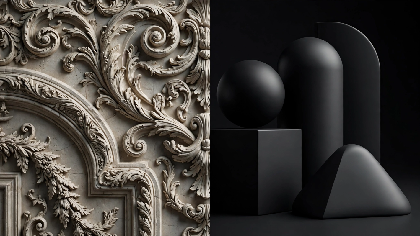
Look at the logos around you and a pattern emerges. Law firms, newspapers and luxury houses wear serifs. Tech startups, streaming services and sportswear wear clean sans-serifs. This is not coincidence. Typeface choice shapes how trustworthy, modern or authoritative a brand feels before a single word is read. The question is which style earns more trust, and the honest answer is: it depends on what kind of trust you need.
The short answer: Serif logos signal tradition, authority and craftsmanship, which builds trust with audiences who value heritage and expertise, like law, finance and luxury. Sans-serif logos signal modernity, clarity and approachability, which builds trust with audiences who value innovation and transparency, like tech and consumer brands. Match the style to your industry’s expectations and your brand’s personality, not to fashion.
What the psychology research actually says
Fonts change how the brain processes information, and processing changes judgment. The landmark study is Alter and Oppenheimer’s 2006 paper in the Proceedings of the National Academy of Sciences, which found that hard-to-read fonts made people perceive higher risk in otherwise identical information. Fluency breeds confidence; disfluency breeds caution.
Applied to logos, the finding cuts both ways. Serif letterforms, with their long print heritage, feel established and credible, which is why banks, universities and newspapers lean on them. Sans-serifs feel plain-spoken and modern, which reads as honest and transparent to younger audiences. A widely cited line of consumer psychology research consistently shows that font style shifts perceptions of a brand’s personality, even when viewers cannot articulate why.
The practical lesson: there is no universally “more trustworthy” style. There is only the style that matches what your customer needs to believe about you. A heritage watchmaker in a geometric sans-serif feels wrong. A AI startup in an engraved serif feels wrong. Trust comes from congruence between the typeface and the promise.
Serif logos: the language of heritage and authority
Serif typefaces carry the visual memory of printed books, carved inscriptions and institutional letterheads. That history does real work for brands that sell expertise, permanence or craft.
Famous serif wordmarks
Vogue’s Didot masthead has signaled fashion authority for over a century. Tiffany and Co.’s serif wordmark sells heritage as much as jewelry. The New York Times nameplate is practically a synonym for institutional credibility. In fashion, the trend even reversed: Burberry dropped its classic serif for a sans-serif in 2018, then restored a serif wordmark in 2023 under Daniel Lee, admitting the heritage equity was too valuable to discard. Zara made a similar serif move in 2019.
Industries where serifs win
Law firms, private banks, luxury goods, heritage hospitality, publishing and higher education all benefit from serif authority. When the product is trust itself, a typeface with four hundred years of printed history is a shortcut. Google Fonts’ library shows how many open-source serif families now exist for brands that want this register without a custom typeface budget.
Sans-serif logos: the language of clarity and momentum
Sans-serifs shed the historical ornament and read as direct, efficient and contemporary. For brands selling innovation or simplicity, that plain-spoken quality is the trust signal.
Famous sans-serif wordmarks
Google’s 2015 switch to the geometric Product Sans announced a friendlier, more product-focused company. Spotify’s custom Circular, Airbnb’s Cereal and Netflix’s custom sans all project approachable modernity. These marks work at tiny sizes on app icons and screens, which is exactly where modern brands live.
Industries where sans-serifs win
Technology, SaaS, fintech startups, sportswear, streaming and direct-to-consumer brands overwhelmingly choose sans-serifs. The style photographs well, scales to favicons, and pairs naturally with the flat UI aesthetics of apps and websites. It also avoids a common trap we cover in our logo design mistakes guide: a fussy serif that turns to mush at 32 pixels.
Serif vs sans-serif: the comparison
| Trait | Serif logos | Sans-serif logos |
|---|---|---|
| Core signal | Tradition, authority, craftsmanship | Modernity, clarity, approachability |
| Trust style | “We have done this for decades” | “We are transparent and easy” |
| Best industries | Law, finance, luxury, publishing, education | Tech, SaaS, sportswear, streaming, DTC |
| Small-size legibility | Weaker; fine strokes clog | Stronger; open forms stay clear |
| Emotional register | Formal, premium, serious | Friendly, energetic, minimal |
| Trend risk | Can feel dated if not done well | Can feel generic; the “blanding” trap |
That last row matters. The 2010s saw a wave of fashion and luxury brands strip serifs for near-identical geometric sans-serifs, a trend critics dubbed “blanding.” Several, like Burberry, have since course-corrected. Chasing the current fashion in type is how a logo ends up redesigned twice a decade.
The hybrid option: mixing both
Many strong identities refuse the binary. A serif wordmark paired with a sans-serif tagline or body font gives heritage up top and clarity below. Editorial brands do this constantly: a Didone headline face with a neutral grotesque for text. The W3C’s classic guide to web fonts remains a useful primer on how serif and sans families behave on screen.
Slab serifs sit in the middle ground: the sturdy, blocky serifs of brands like Volvo or the NBA project confidence without formality. And custom lettering can blend traits, a sans skeleton with bracketed serif-like terminals, though that is work for a type designer, not a font menu.
When mixing, follow the pairing rules in our font pairing guide: contrast with purpose, limit yourself to two families, and make sure the combination survives at favicon size.
How to choose for your brand in 2026
- Start with the audience, not your taste. List the three adjectives your best customers would use for you. If they say “established, expert, premium,” lean serif. If they say “fast, simple, friendly,” lean sans.
- Study your category’s visual language. Breaking category norms can differentiate you, but it costs trust until you earn it back. A challenger bank can go serif if everything else about it signals reliability.
- Test at real sizes. Render the wordmark at billboard, website header and 32-pixel favicon sizes. If the serif version dies at small sizes, you need a simplified responsive variant or a different choice.
- Check the trademark landscape. Common geometric sans-serifs risk looking like competitors. A distinctive serif or a customized sans protects you legally and visually.
- Sleep on it for a week. Type trends move fast and logos should move slow. If the choice still feels right after a week away, commit.
Frequently Asked Questions
Are serif fonts more trustworthy than sans-serif fonts?
Not universally. Serif typefaces signal heritage and authority, which builds trust in law, finance, luxury and publishing. Sans-serifs signal clarity and modernity, which builds trust in tech and consumer brands. Research on processing fluency shows that fonts shape judgment, but the trustworthy choice is the one that matches what your audience needs to believe about you.
Why did so many brands switch from serif to sans-serif logos?
Digital screens drove the shift. Sans-serifs stay legible at small sizes on phones and app icons, where modern brands live, while fine serif strokes clog at 32 pixels. The 2010s fashion rebrands took this too far into generic “blanding,” and several brands, notably Burberry in 2023, have since restored serif wordmarks to reclaim their heritage equity.
What is the most trustworthy font for a logo?
There is no single answer, but the safest bets are well-drawn classics in the right register: a Garamond or Caslon style serif for heritage industries, a Helvetica, Inter or geometric sans for modern ones. What matters more than the specific font is execution: proper spacing, balanced proportions and a design that holds up from billboard to favicon.
Can a tech company use a serif logo?
Yes, and some do it brilliantly. Serif type can differentiate a tech brand in a sea of geometric sans-serifs, signaling craft and substance over startup sameness. It works best for companies selling expertise or premium products rather than speed and simplicity. Just make sure the serif holds up at small sizes, or design a simplified responsive version.
Should my logo and website use the same font style?
They should belong to the same family of feeling, but they do not need to be identical. A common system is a distinctive serif or custom wordmark for the logo, paired with a highly legible sans-serif for body text and UI. Keep it to two type families maximum so the identity stays coherent across the logo, website and documents.
Conclusion
Serif logos earn trust through heritage and authority; sans-serif logos earn it through clarity and modernity. Neither is inherently more trustworthy. The research is clear that typeface shapes perception, and the market is clear that congruence beats fashion: match the style to your industry’s expectations and your brand’s personality, test at every size, and resist redesigning every time trends shift. The clear takeaway: pick the typeface your customers already associate with the promise you are making, then commit to it for the long term.